Diba is an international logistics company operating across air, land, and sea, delivering a distinct and elevated standard of service through advanced systems and technology. Built on speed, precision, and respect, the brand has earned the trust of its clients over time, becoming a reliable long term partner.
Following a comprehensive review of the company’s background and detailed conversations with its founders, we developed the brand strategy and conceptual identity. Once alignment was achieved, the process moved into the design phase, where the logo and visual identity system were created and finalized.
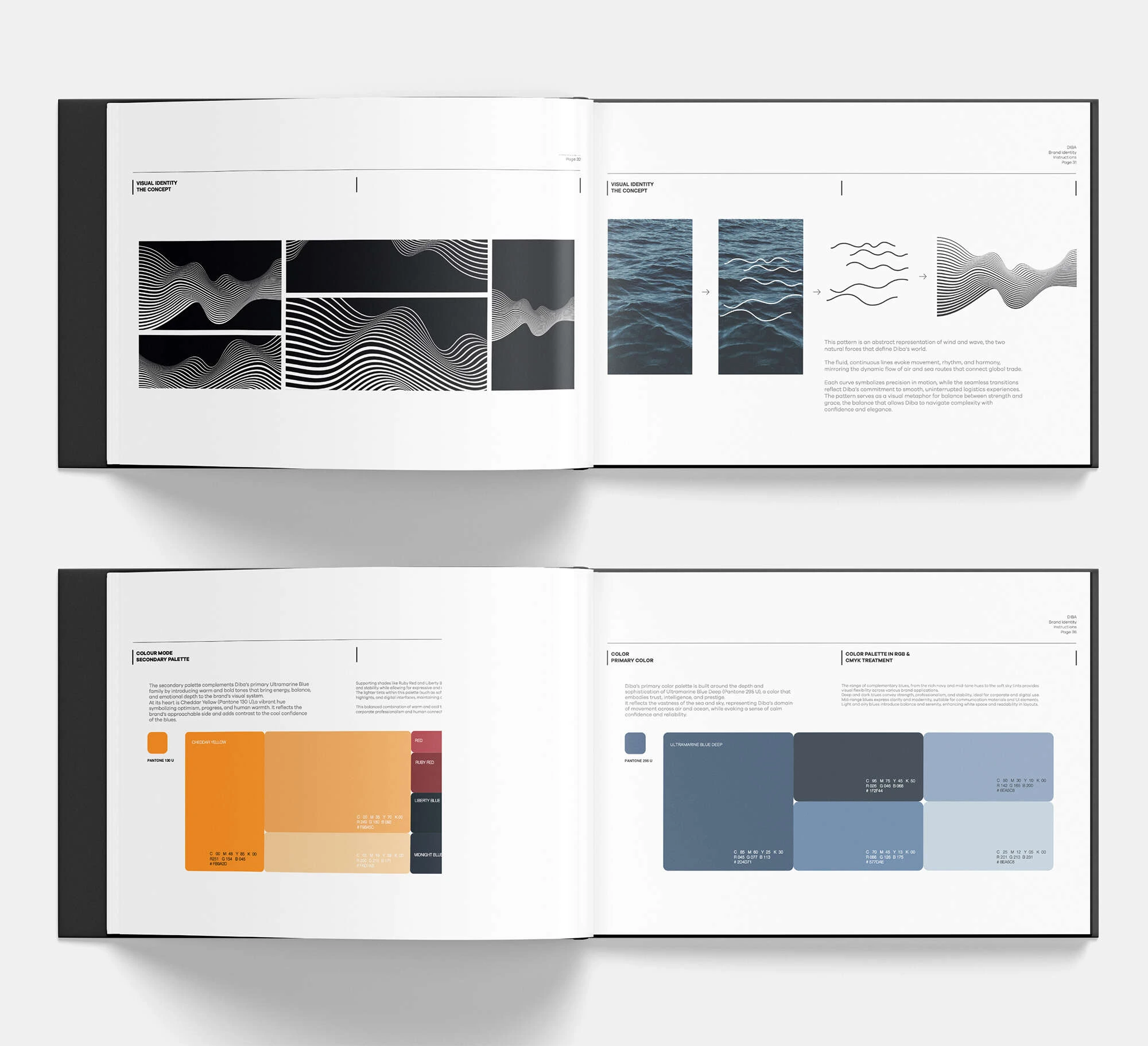
The core visual concept draws from fluid, parallel waveforms, inspired by both the company’s name and its primary operational domains: sea and air. These elements formed the basis of a dynamic and cohesive pattern language.
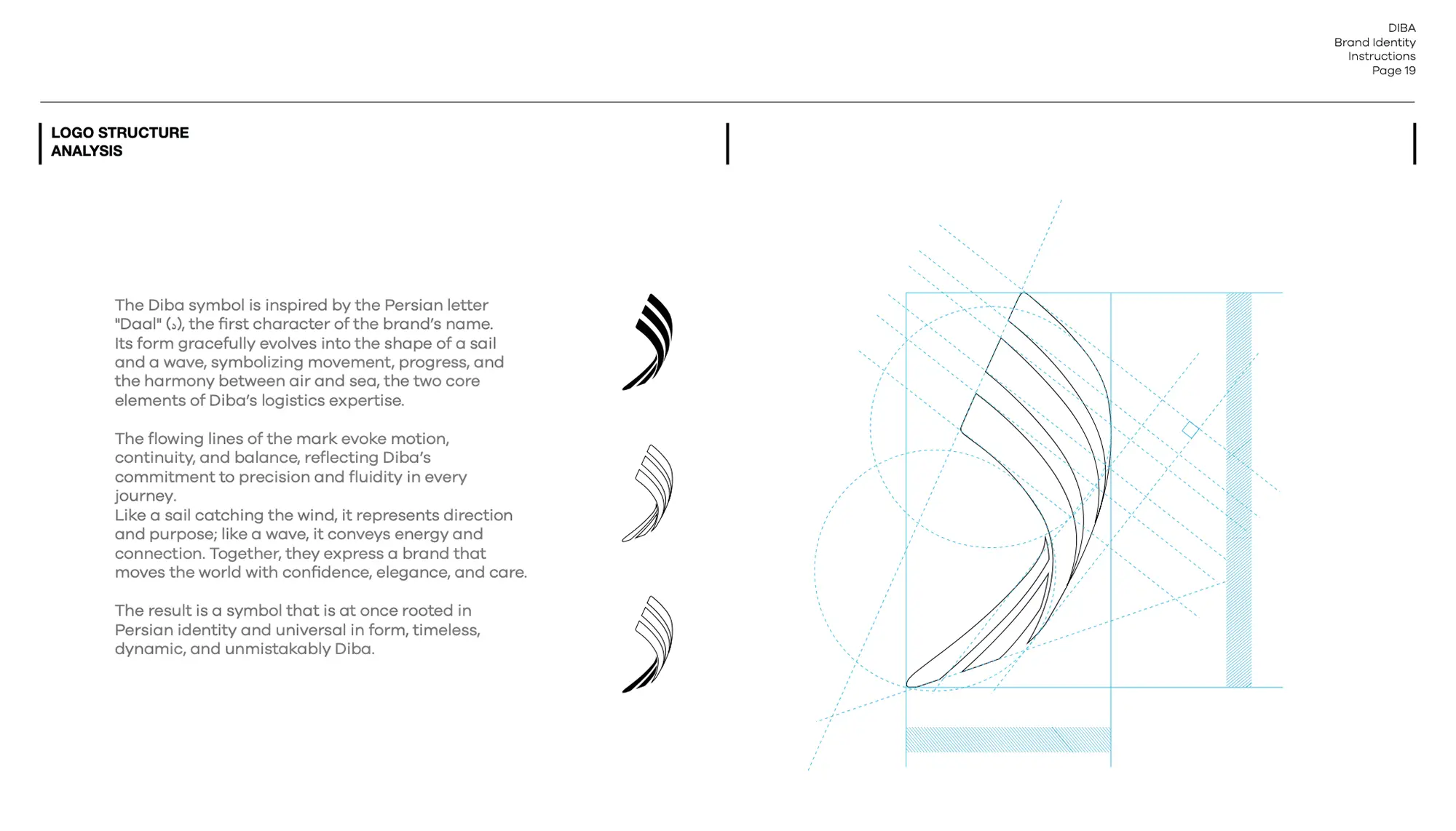
The logo is derived from the Persian letter “Dal,” the initial of “Diba,” and was carefully crafted into a form reminiscent of a sail, capturing motion, direction, and forward momentum.
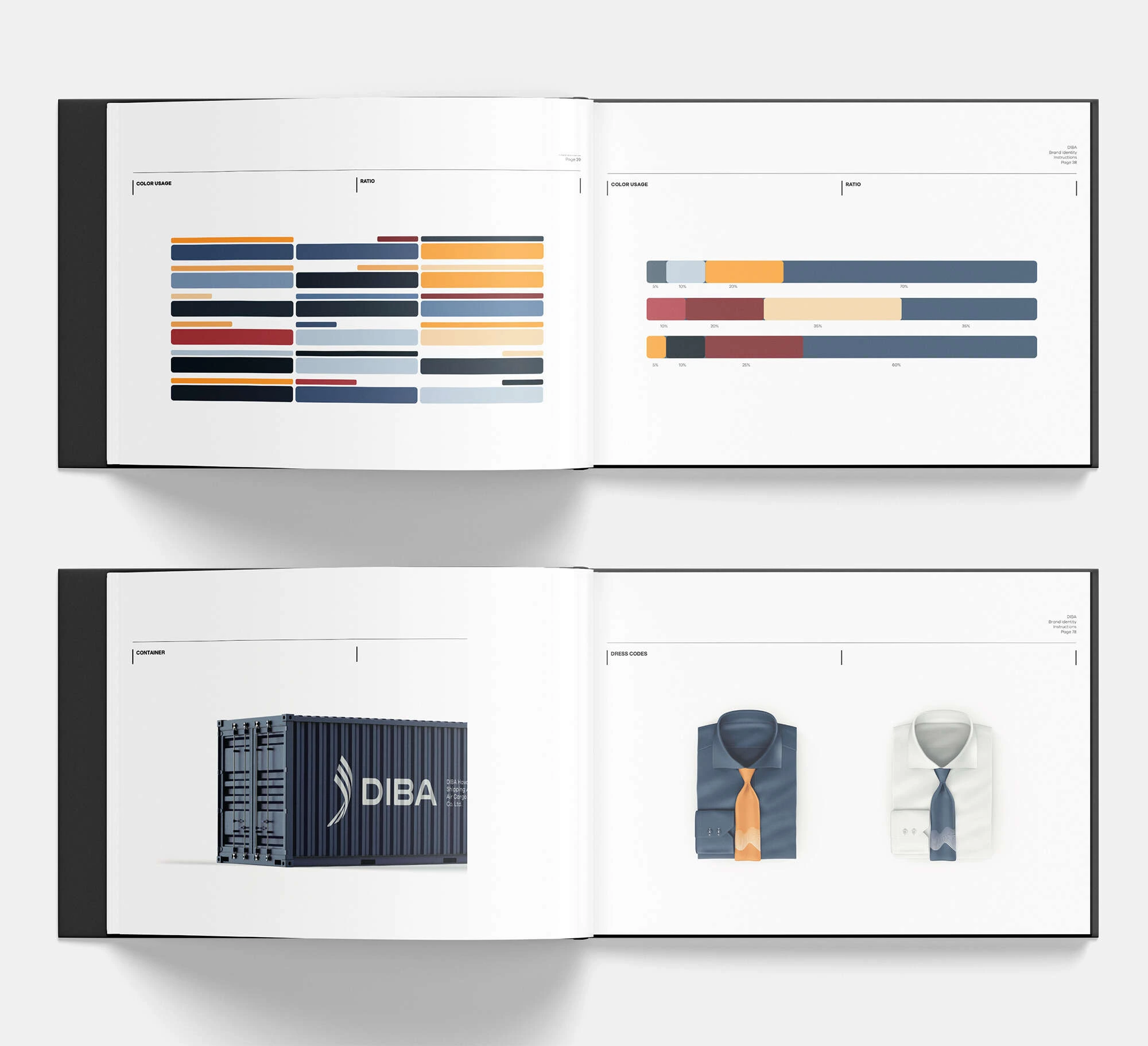
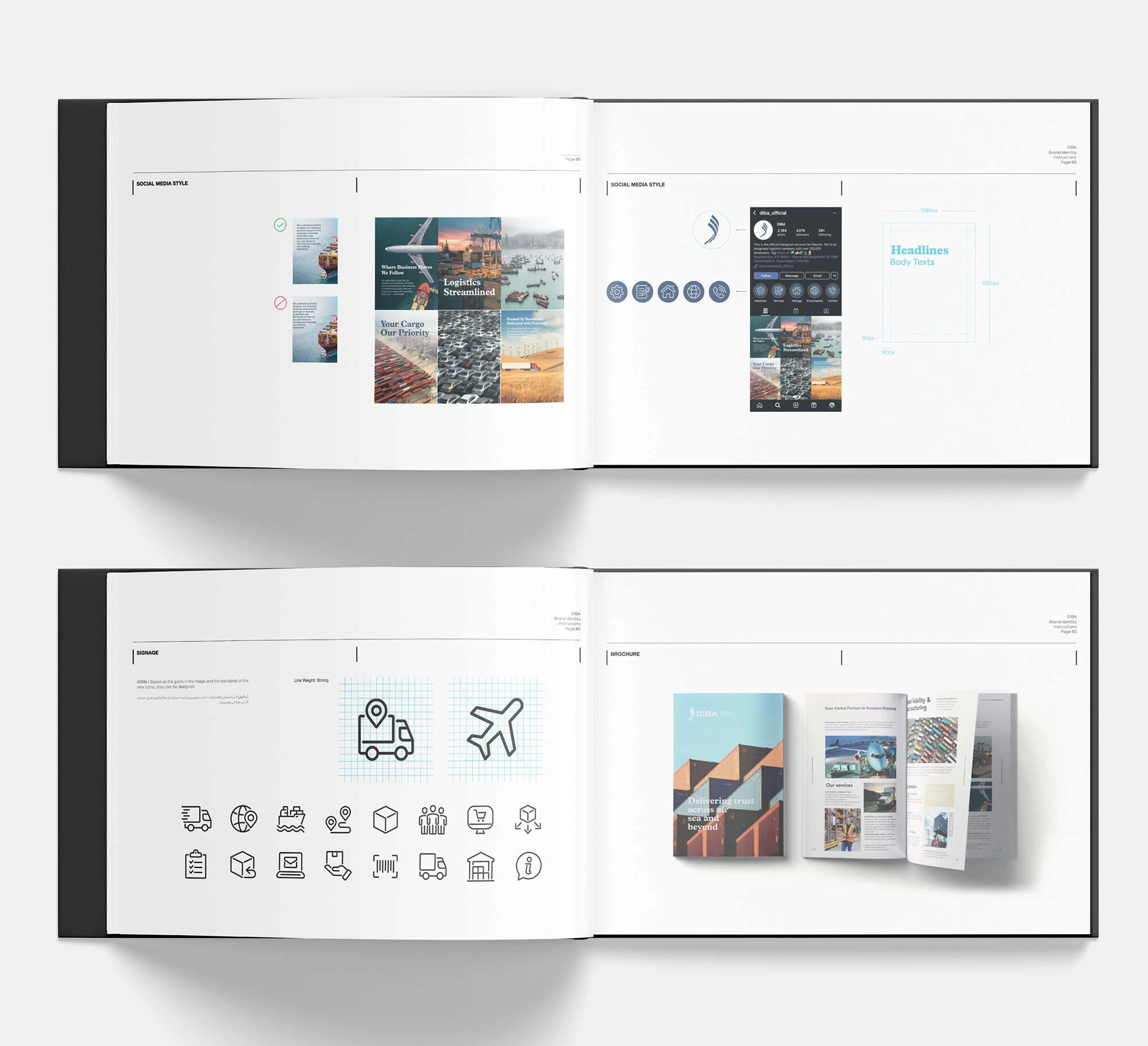
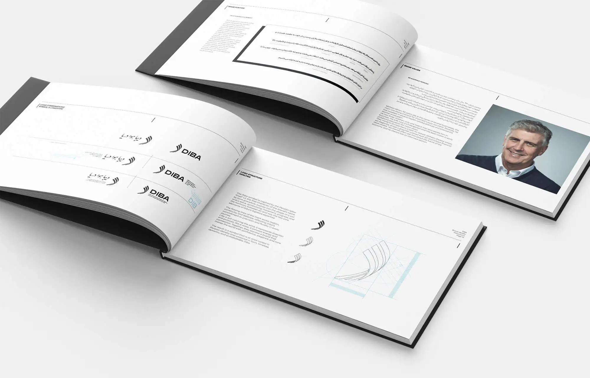
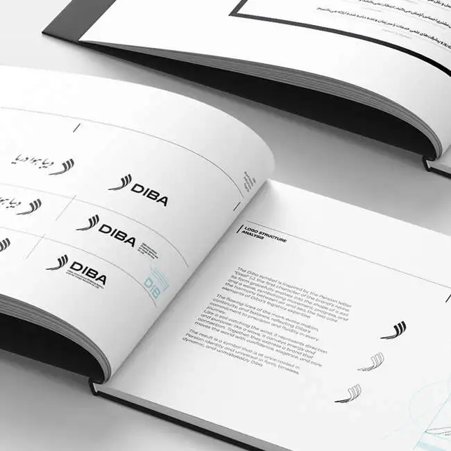
The project concluded with the development of a comprehensive, brand book, along with the full production of branded materials, from stationery to corporate assets, all executed and delivered by BOOM Marcom.